Overview
As part of a broader redesign of the WorkForce Suite, I led the Absence Management module. Our goal was to modernize dated tools and make requesting and managing time-off simple, fast, and reliable for everyone — especially the growing number of deskless employees (linemen, farmhands, technicians) working away from a traditional desktop.
We focused on a mobile-first experience that works beyond the four walls of the workplace, reduces friction in common tasks, and brings clarity to statuses, balances, and approvals. The work you’ll see below traces the journey from auditing the legacy experience through research, flows, and high-fidelity design, all the way to usability testing and developer handoff.
Internal Audit
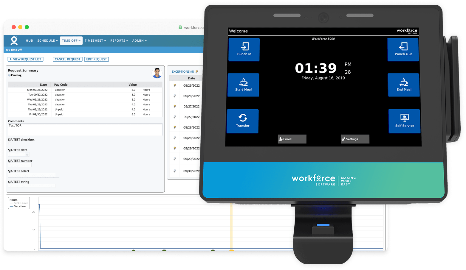
I began by auditing our existing absence tools. The legacy web app was outdated and desktop-only, leaving employees frustrated that they couldn’t request time off on mobile. Meanwhile, self-service features on wall clocks caused bottlenecks, leading clients to disable them. Clocks also couldn’t be accessed outside of work or business hours, limiting flexibility.
- Legacy web app was outdated and not mobile-responsive
- Wall clocks created logjams and missed punches
- Clients often disabled self-service features
- No remote or after-hours access
User Research
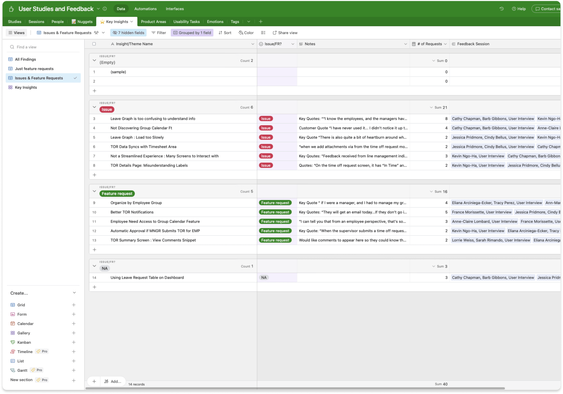
To ground the redesign in real employee needs, I partnered with a UX researcher to conduct user interviews and feedback sessions. I helped shape the study plan, observed live sessions, and took detailed notes on pain points and feature requests. After synthesizing findings in Airtable, I shared the top insights with the product team to guide design priorities.
- Employees needed a mobile-friendly solution that worked outside of the workplace.
- The request process had to be streamlined, with advanced options hidden until needed.
- Access to the group calendar was critical for planning time off around co-workers.
Refining Requirements
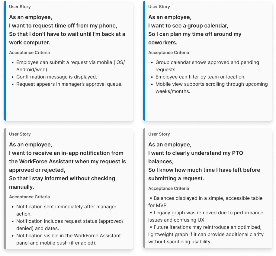
After synthesizing our research findings, I partnered with the product team to translate insights into clear requirements, user stories, and acceptance criteria. Together we prioritized the backlog, focusing first on an MVP that delivered a mobile-friendly solution and streamlined request flow. More advanced features were documented as future enhancements to revisit later.
On the design side, I managed our own backlog of design tasks and aligned with product leadership to sequence work in parallel. The user stories shown here illustrate that split: two critical needs that shaped the MVP, and two additional opportunities we deferred for future iterations. This balance helped us move quickly while ensuring we addressed the most pressing pain points.
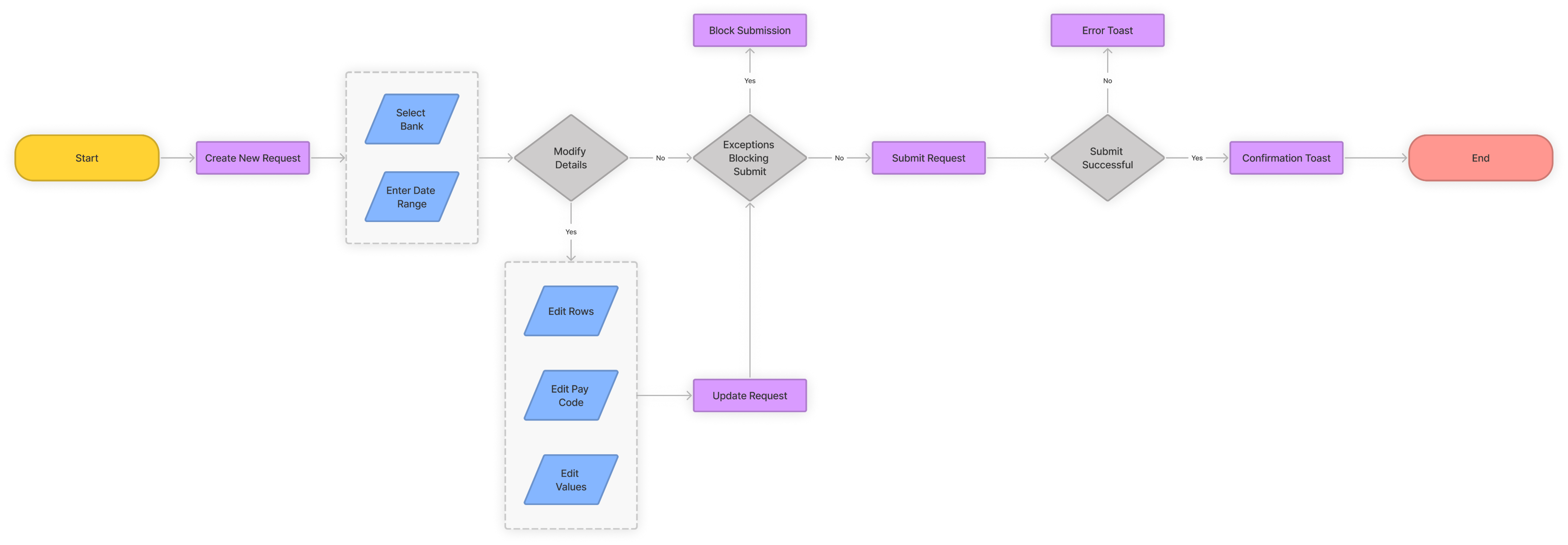
User Flows
Before moving into design, I mapped the end-to-end absence request flows to validate direction with Product and Engineering. The legacy flow required employees to first select a bank and date range, then click through to a separate screen with multiple editing options (rows, pay codes, values). This added unnecessary steps and complexity for simple requests.
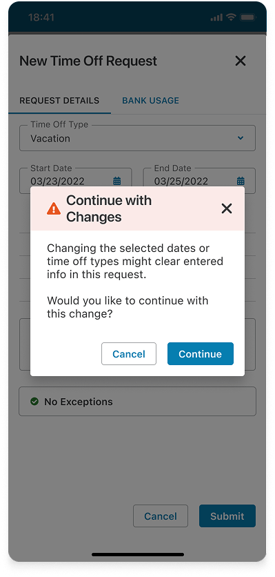
We streamlined the experience by consolidating the flow into a single screen. Employees could now complete a straightforward request by selecting a bank and date range, while advanced editing options were hidden behind a “Modify” step. This reduced friction for most users while still supporting more complex scenarios when needed.
Wireframes
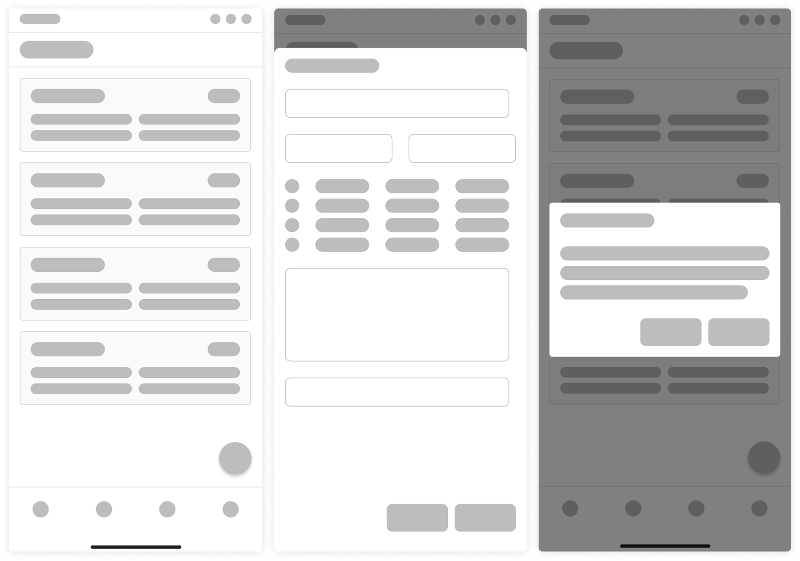
Because we had a mature design system, I usually worked directly in high fidelity. When I did use wireframes, it was sparingly—mainly to explore screen layouts and decide which components from the system would best support the design. They acted as quick blueprints, bridging user flows and polished mockups without heavy investment in visual detail.
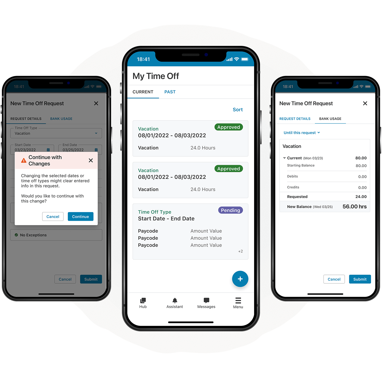
High-Fidelity Mockups
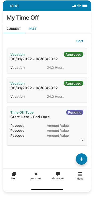
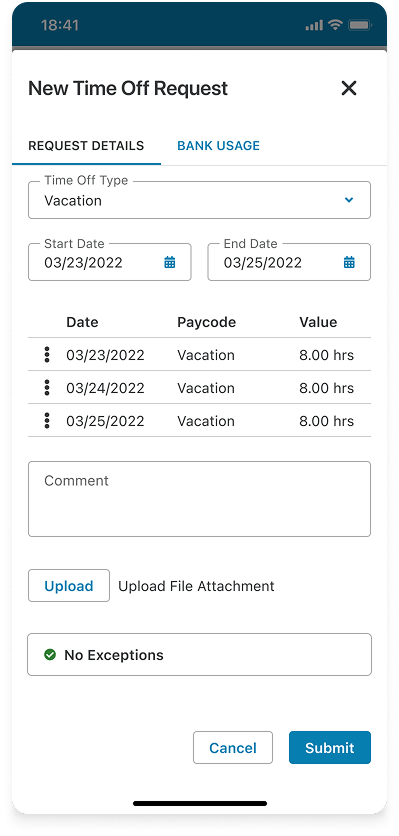
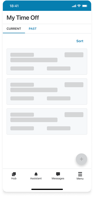
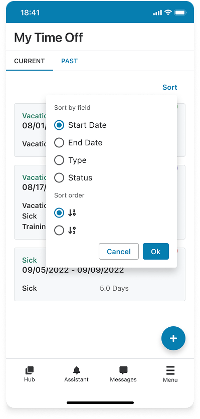
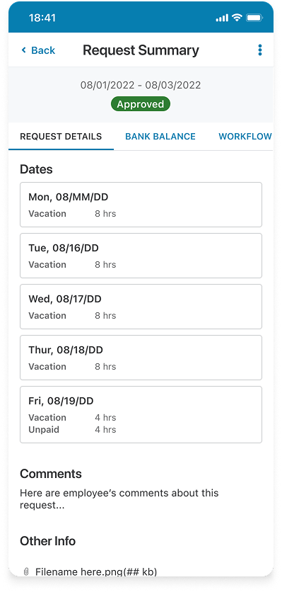
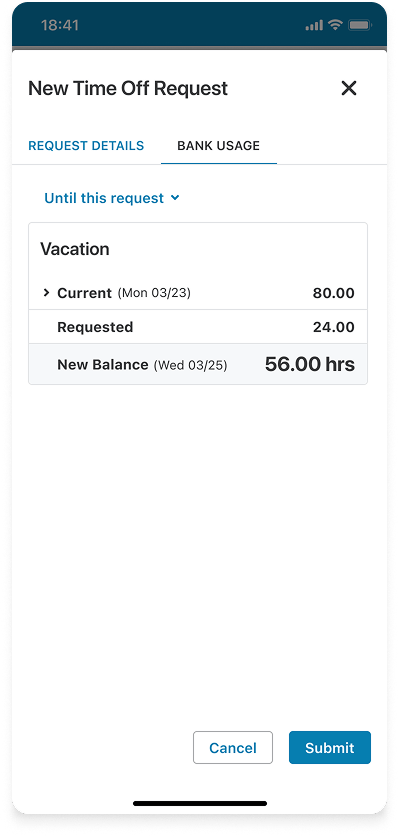
Using our design system, I produced dozens of high-fidelity screens covering employee requests, manager approvals, and supporting admin tasks. Key mockups focused on solving the pain points uncovered in research: a clear request history page with statuses, a request summary screen that shows details and bank balance impacts, and a streamlined new request flow that reduced unnecessary steps.
These mockups demonstrated how the redesign simplified core interactions while maintaining flexibility for more complex scenarios. Every screen was built from system components to ensure consistency, accessibility, and performance at scale.
Additional Screens
Prototype
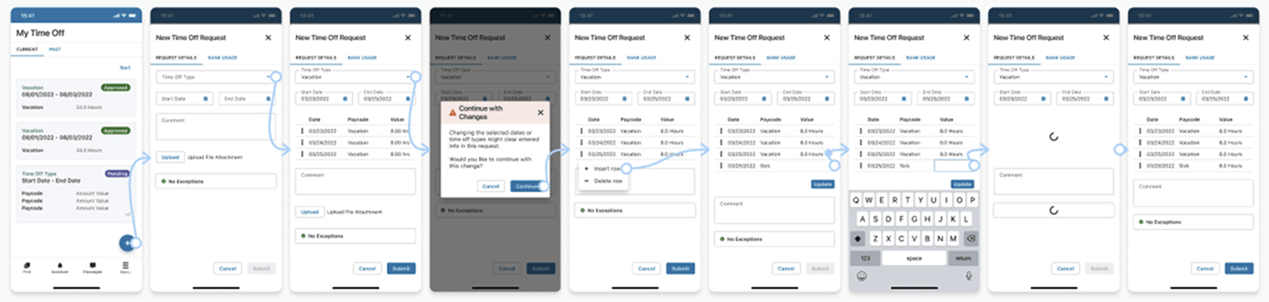
After finalizing key mockups, I built an interactive prototype in Figma to validate the end-to-end flow. This allowed us to walk through the request history, summary, and new request experiences as a connected journey instead of isolated screens.
The prototype was critical for aligning with Product and Engineering and prepared us for usability testing. It gave stakeholders a realistic sense of the streamlined flow and helped surface edge cases before we moved into development.
Usability Testing
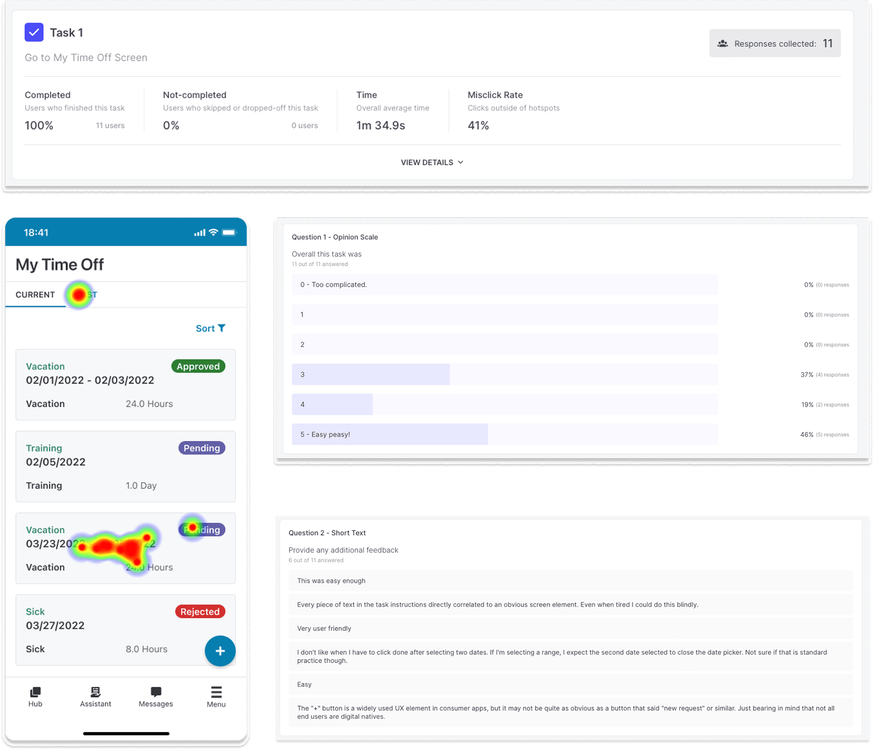
To validate our designs, we ran an unmoderated usability study using Useberry. This allowed us to integrate our Figma prototypes directly into the testing tool and observe how users interacted with the new flows in a realistic environment.
We created a series of tasks covering the most critical actions, including viewing request history and submitting new requests. The platform provided both quantitative metrics—such as task completion rates, time on task, and misclicks—and qualitative insights through rating scales and open-text responses. Together, these gave us confidence that the redesign simplified the process and addressed the biggest usability issues found in the legacy experience.
Dev Handoff & Support
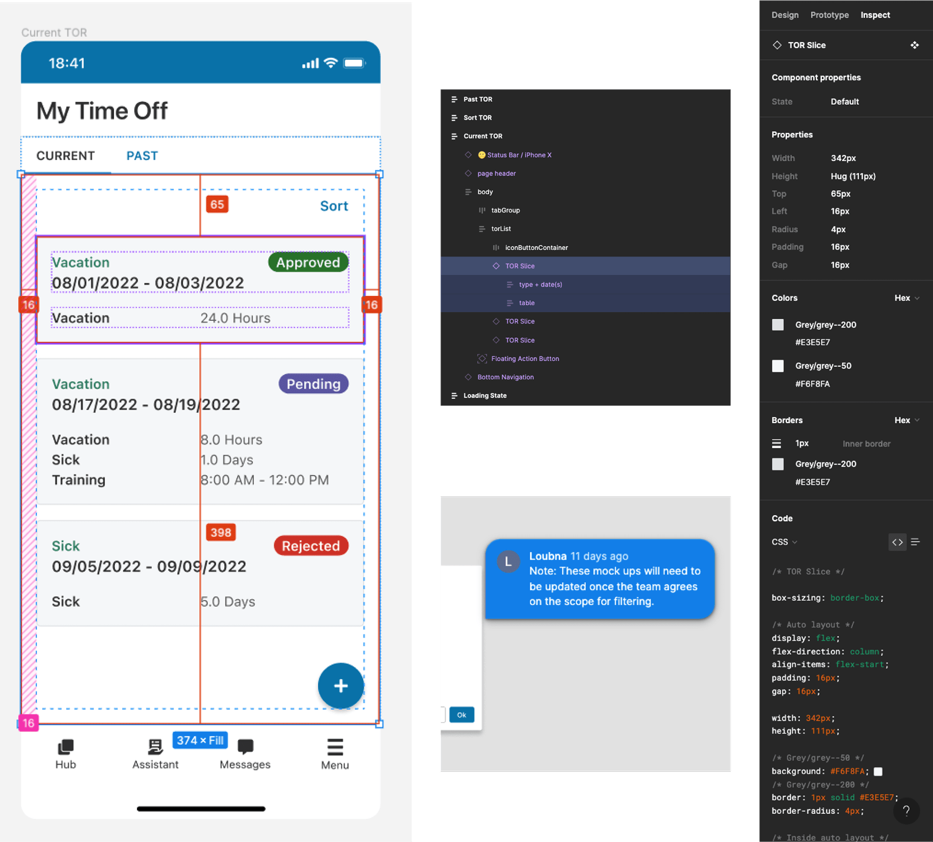
Once designs were finalized, I led a handoff walkthrough with the product manager and engineering team to align on scope, edge cases, and states. I provided implementation-ready specs using Figma’s Inspect panel, including spacing, typography, tokens, and component structure.
Support continued through implementation. I monitored Figma comments, stayed available on chat for quick questions, and reviewed related pull requests to help ensure pixel‑accuracy and accessible, token‑driven UI.