Overview
When I joined Copper Hill as the first product designer, there was no shared design foundation. Just an inconsistent mix of Angular Material and Tailwind, and a growing gap between what was being designed and what was getting built.
The problem wasn't just visual inconsistency. Every feature review turned into a long list of front-end corrections, rework that slowed delivery and pulled engineers away from more complex problems.
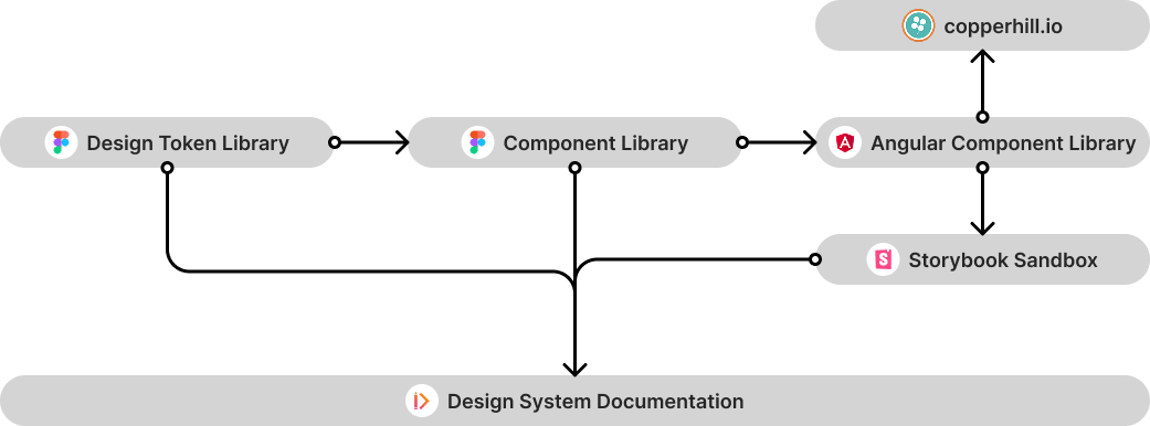
After reviewing the existing architecture, we made the call to move away from Angular Material and build our own component library on top of Tailwind. I established a three-tier token architecture to bring guardrails to Tailwind's flexibility, with primitive tokens mapped directly to its utility classes, giving design and engineering a shared vocabulary from the start. From there, a Figma component library, Angular component library, Storybook sandbox, and Zeroheight documentation gave every discipline a single source of truth to ship from.
Token Architecture
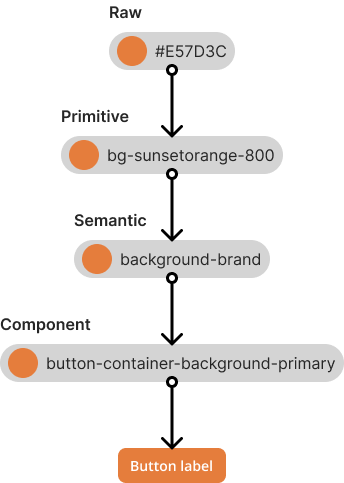
The token architecture was the natural starting point, given the team's existing commitment to Tailwind. Rather than working around that decision, I designed with it. Primitive tokens mirror Tailwind's own class structure, so developers inspecting in Figma's Dev Mode saw token names they already recognized, reducing the translation gap between design and code.
Semantic tokens sit above the primitives, abstracting raw values into meaningful roles like background-brand or text-error, and are what made light and dark theming possible without duplicating designs or components. Component-specific tokens formed a narrow third layer, used only where semantic tokens couldn't cover a specific case — the navigation bar needing different background values in each theme being the clearest example.
On the engineering side, the primary value lived in Figma. We explored JSON token exports but the team continued using Tailwind's inline utility classes in code, a practical tradeoff given where the system was at the time.
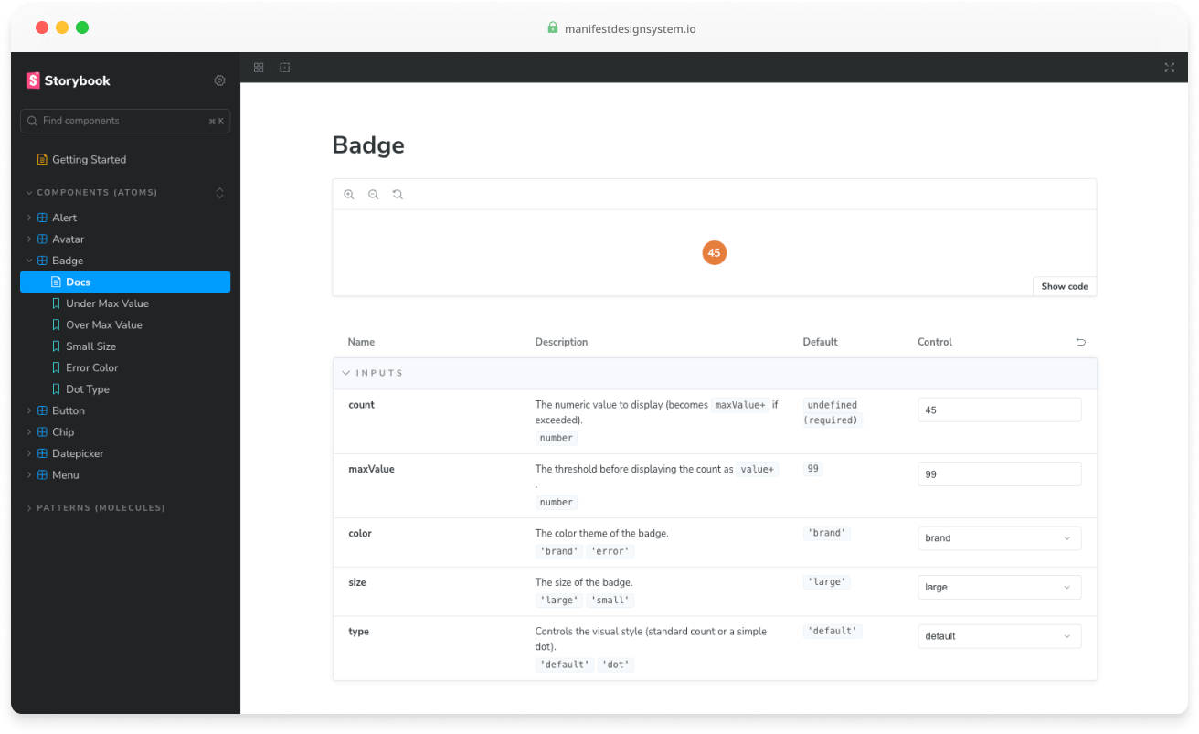
Components - Atoms
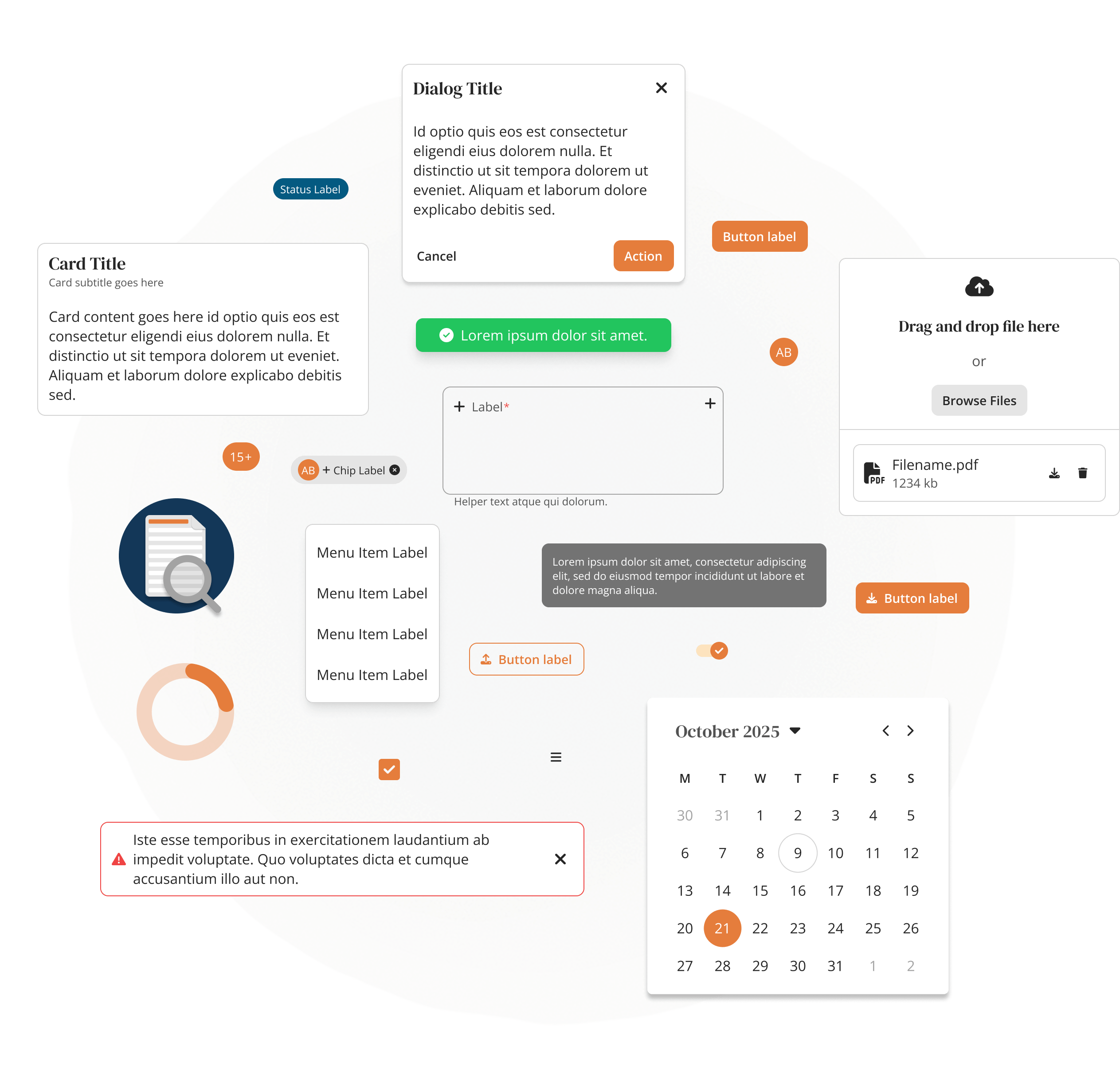
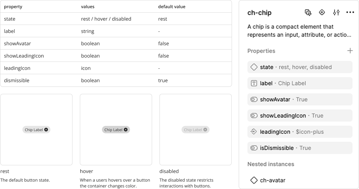
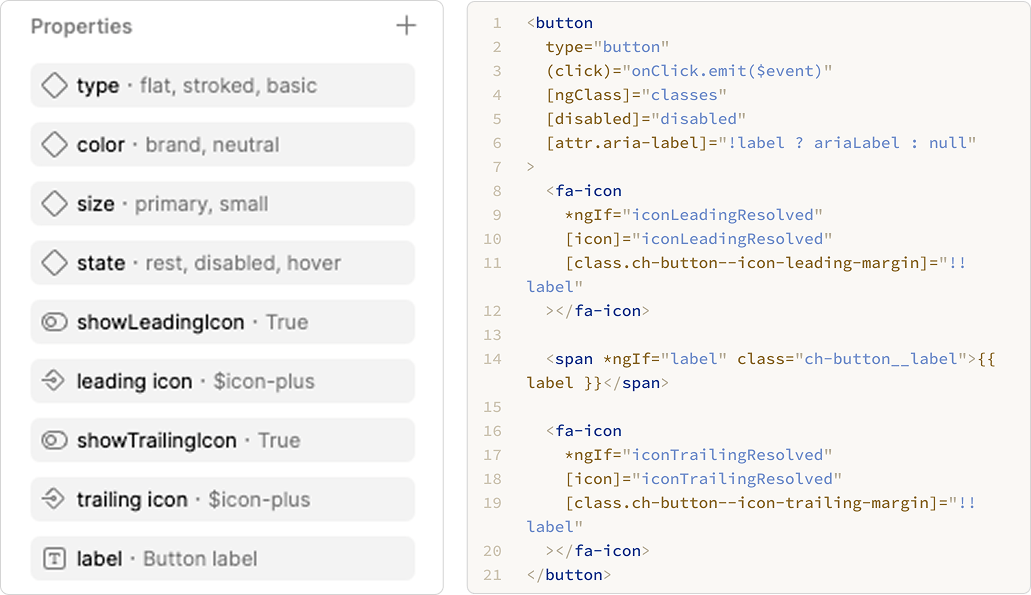
Atoms are the smallest building blocks of the system, buttons, inputs, labels, icons, and form elements. Every atom was built in Figma using the token architecture as its foundation, so updates to the token layer cascaded automatically without touching individual components.
I built components the way they'd be built in code. Auto Layout mirrors CSS flexbox and grid, so the behavior designers see in Figma matches what developers implement. Component properties handle state and variant changes, toggling icons, swapping labels, adjusting sizes, without duplicating components. Developers get a clear, predictable blueprint. Designers get flexibility without sprawl.
Components - Molecules & Organisms
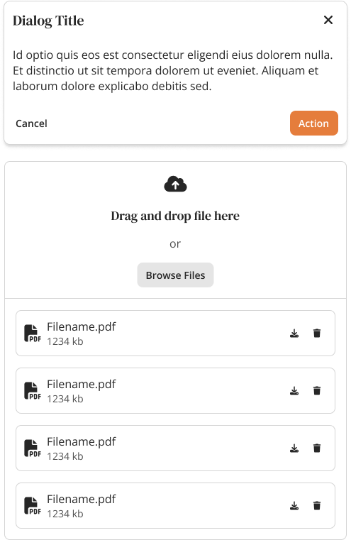
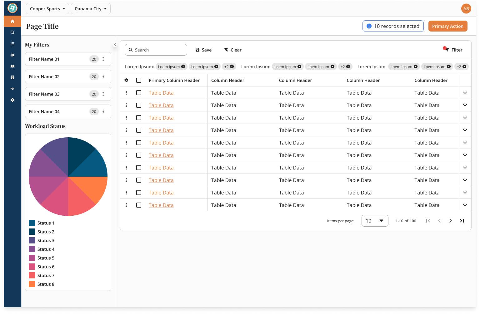
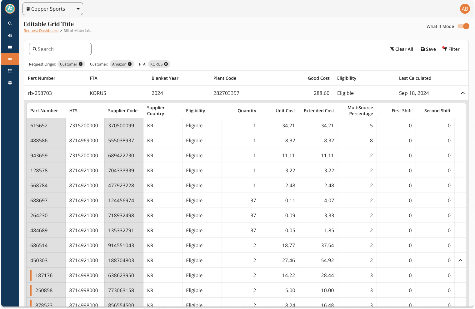
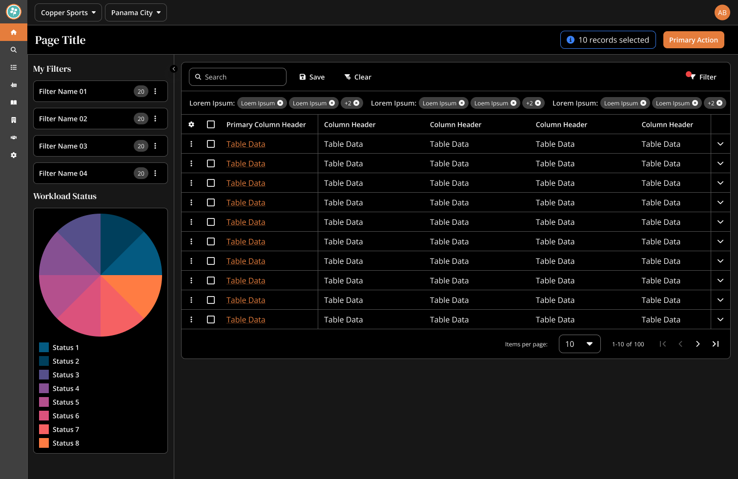
With atoms in place, we assembled them into larger, more purposeful components. Standard molecules like dialogs, filters, pagination, and file uploaders. More complex organisms like data tables, input grids, and process steppers, which started to reflect the specific workflows of the Copper Hill platform.
These components were still part of the system architecture, but the more complex organisms are where product context started to shape design decisions. That thinking carries into the next section, where components come together into full patterns and templates built around real GTM workflows.
Templates & Patterns
Components become a design system when they start solving real product problems. At this layer, the work became specific to Copper Hill and the complexity of global trade workflows.
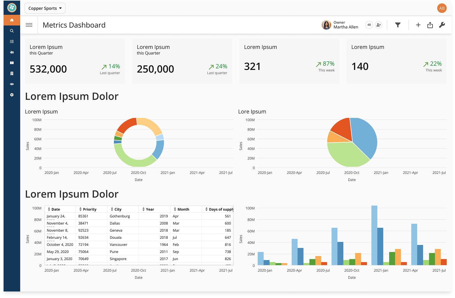
We established templates across five core areas: data ingestion, document management, workload views, editable data grids, and analytics dashboards. These had to account for high data density, multi-step workflows, and two distinct user paths, AI assisted document processing and manual data entry, within the same interface.
Every module shared the same underlying workflow, global or otherwise. By the time a new screen needed designing, most of the decisions had already been made at the pattern level.
Theming
The token architecture paying off in practice is best seen in the light and dark mode comparison. What looks like two distinct themes is actually one set of semantic tokens resolving to different primitive values, controlled by a single variable mode switch at the page or frame level.
No duplicated components, no duplicated screens. Changing the active mode cascades through the entire design automatically. The same architecture that made light and dark mode straightforward also laid the groundwork for future client-specific themes and brand variations, without touching a single component.
Angular Components & Storybook
To get the Angular component library started, I used ChatGPT to prototype a handful of components, validating the Figma-to-Angular translation and level of effort before handing it to the engineering team. From there, ownership moved to our front-end developer, with roughly 10 to 15 components released by the time I left.
I took the same approach with Storybook, standing up a proof of concept for a component testing sandbox with Figma integration. It landed on the engineering backlog but hadn't moved forward before I left.
Regular design reviews against the Angular components were how we knew the system was working. Fewer inconsistencies flagged, fewer corrections in the backlog. The feedback loop between design and code was the point.
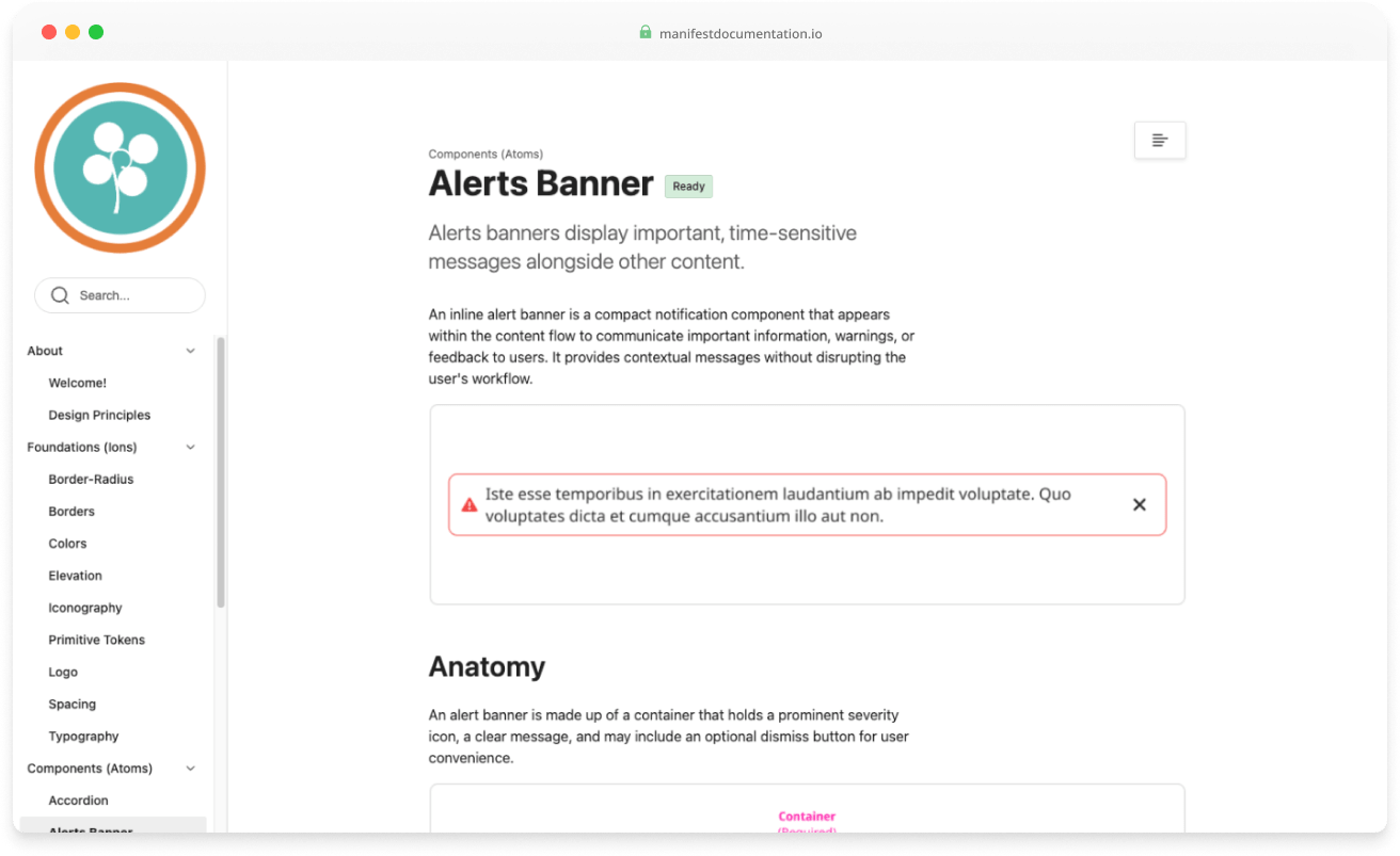
Documentation
Zeroheight served as the single source of truth for Manifest, covering the token library, component anatomy, usage guidelines, and pattern documentation. Every component page followed a consistent structure so designers and developers could make informed decisions without back-and-forth.
Its integration with Figma kept design and documentation in sync. I was also in the process of integrating the Angular component library, with the goal of showing design and code side by side in a single reference.
Impact
Manifest became the foundation the Copper Hill platform shipped from. Designers and developers stopped solving the same problems twice, and the feedback loop between design and code started producing measurable results.
Figma component sets in the library, excluding icons, covering everything from atoms to complex organisms like data tables, navigation, and multi-step workflows.
Of features entering PI planning had accompanying designs after Manifest, up from 10% when I joined.
Angular components released and in production before I left, with the full library on the engineering roadmap.