Discover
UX Audit
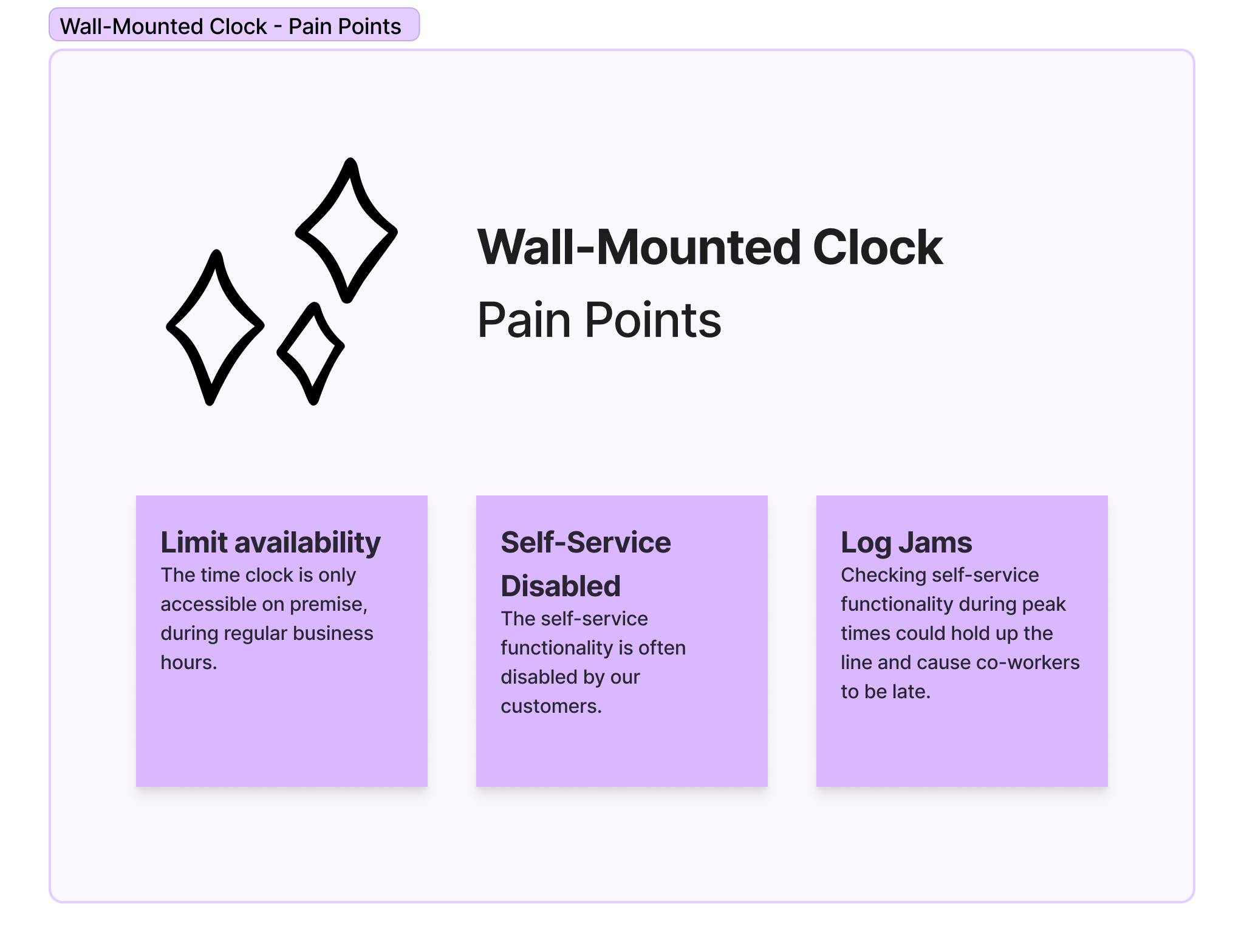
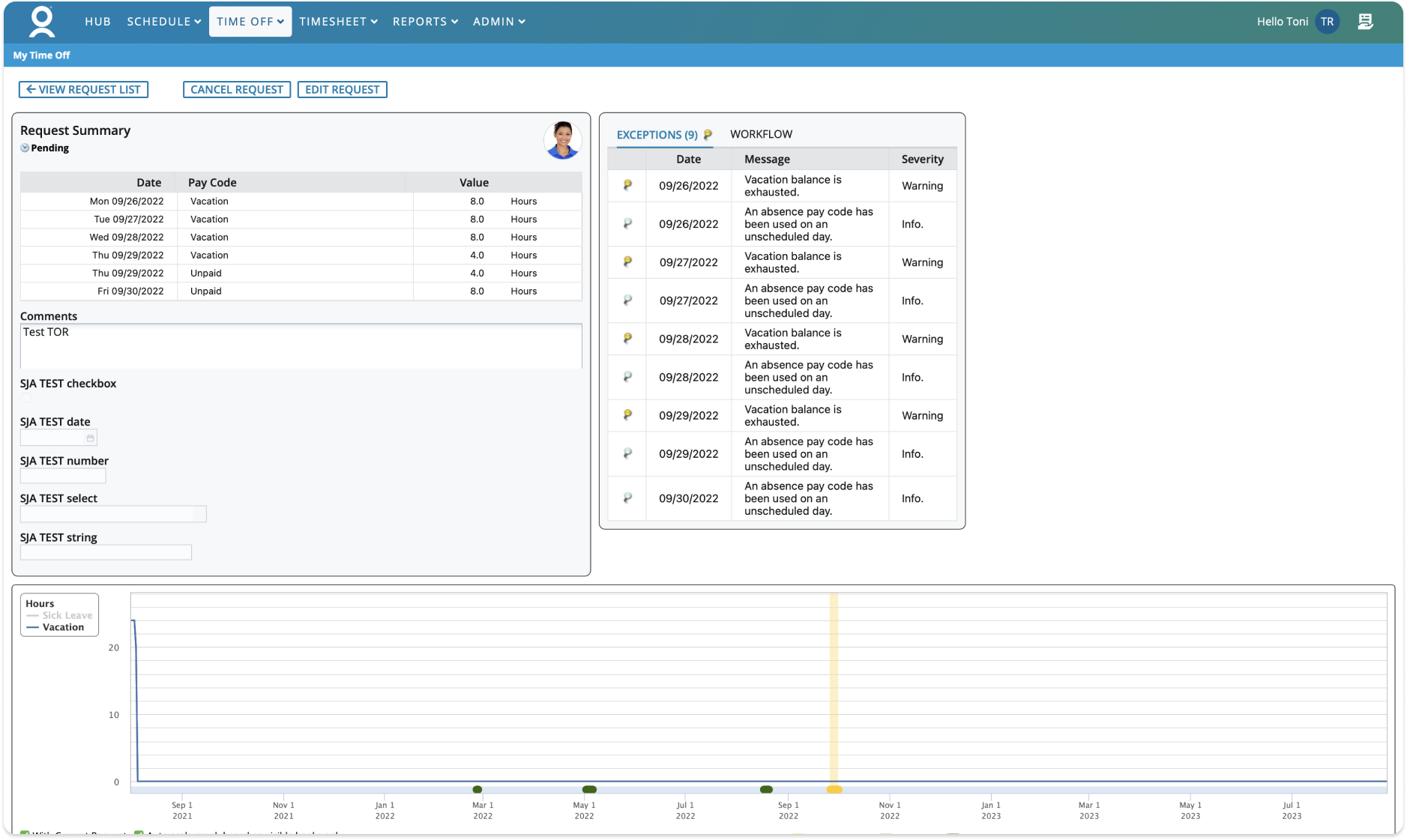
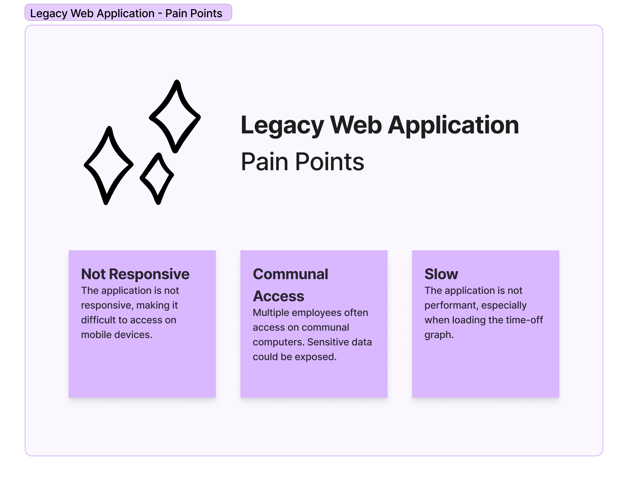
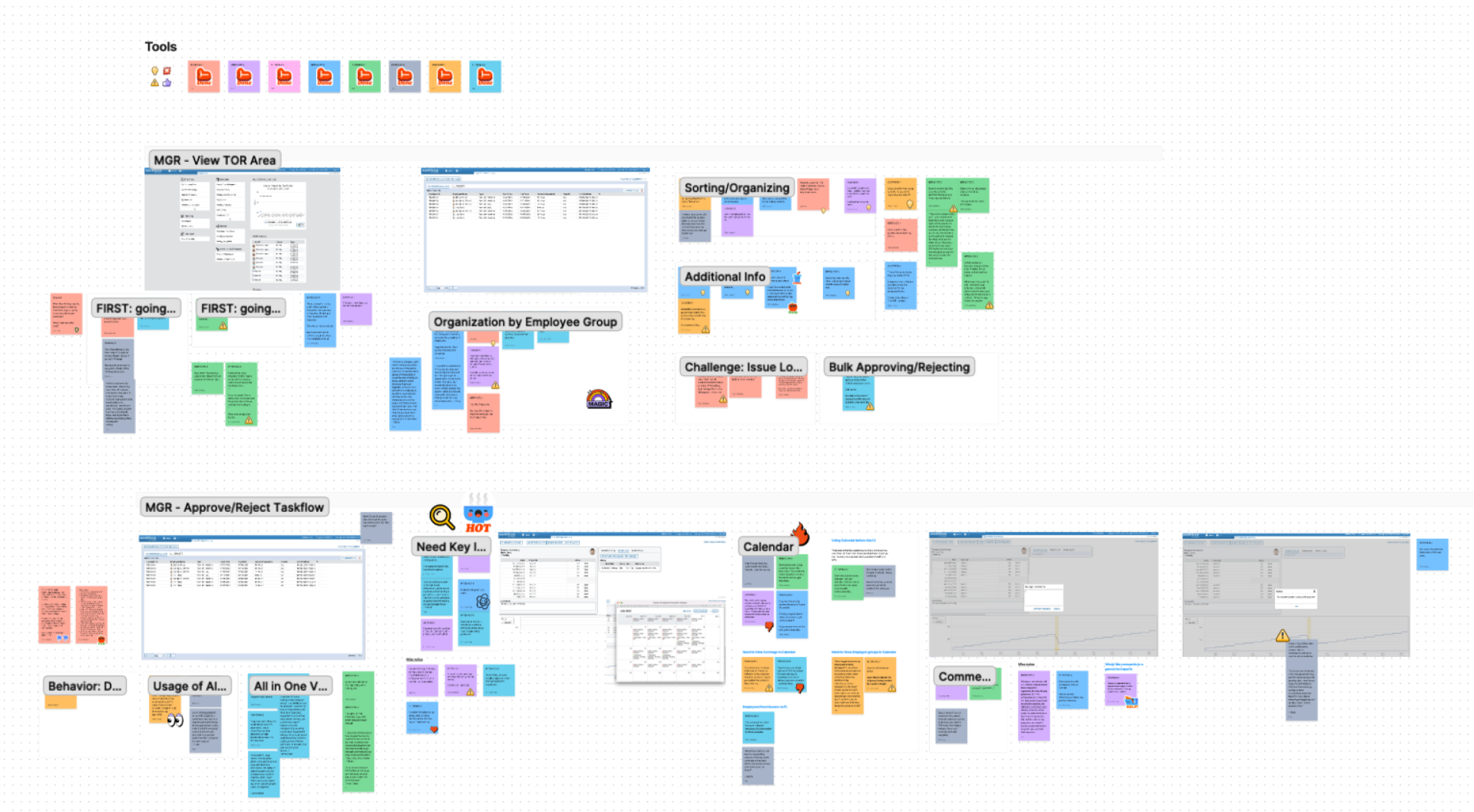
I began this project by conducting a thorough audit of our existing platforms. During this process, I carefully examined the user experience of our wall-mounted time clock and outdated web application and identified several areas of improvement.
Competitor Analysis
I examined various absence management platforms in the market, including solutions offered by our direct competitors as well as other innovative startups. This review aimed to identify areas for improvement and any existing gaps in the market.
|
When I Work |
Homebase |
Quicktime |
| Responsive/Mobile App |
|
|
|
| Mixed Banks |
|
|
|
| Comments |
|
|
|
| Partial Day Requests |
|
|
|
| Multiple Partial Day Requests |
|
|
|
| Bank Balances |
|
|
|
User Interviews
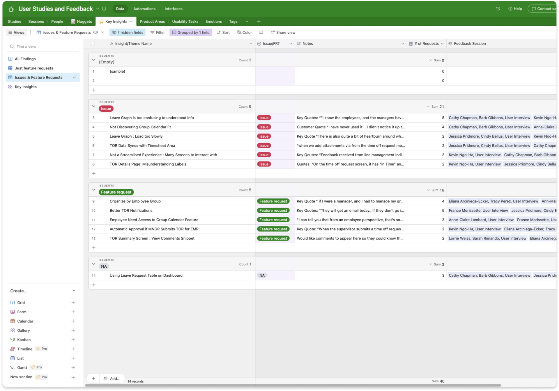
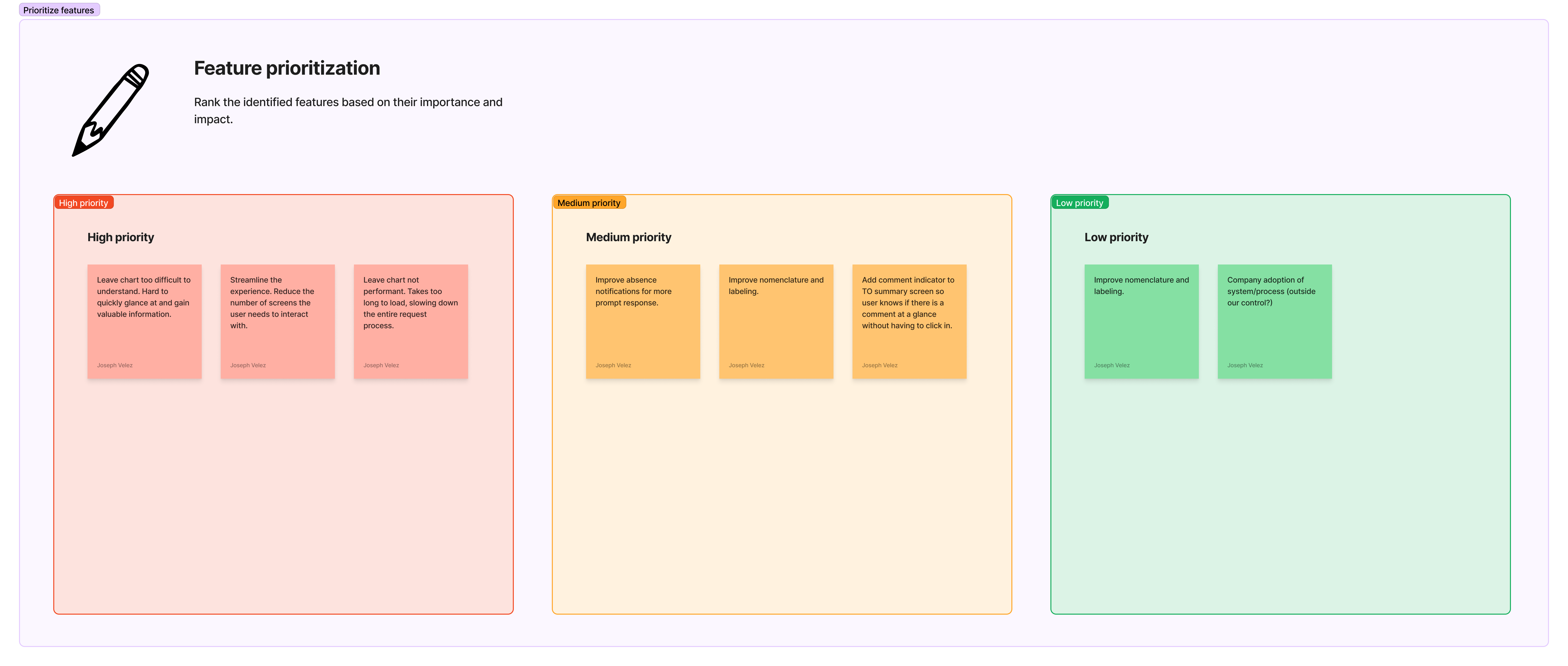
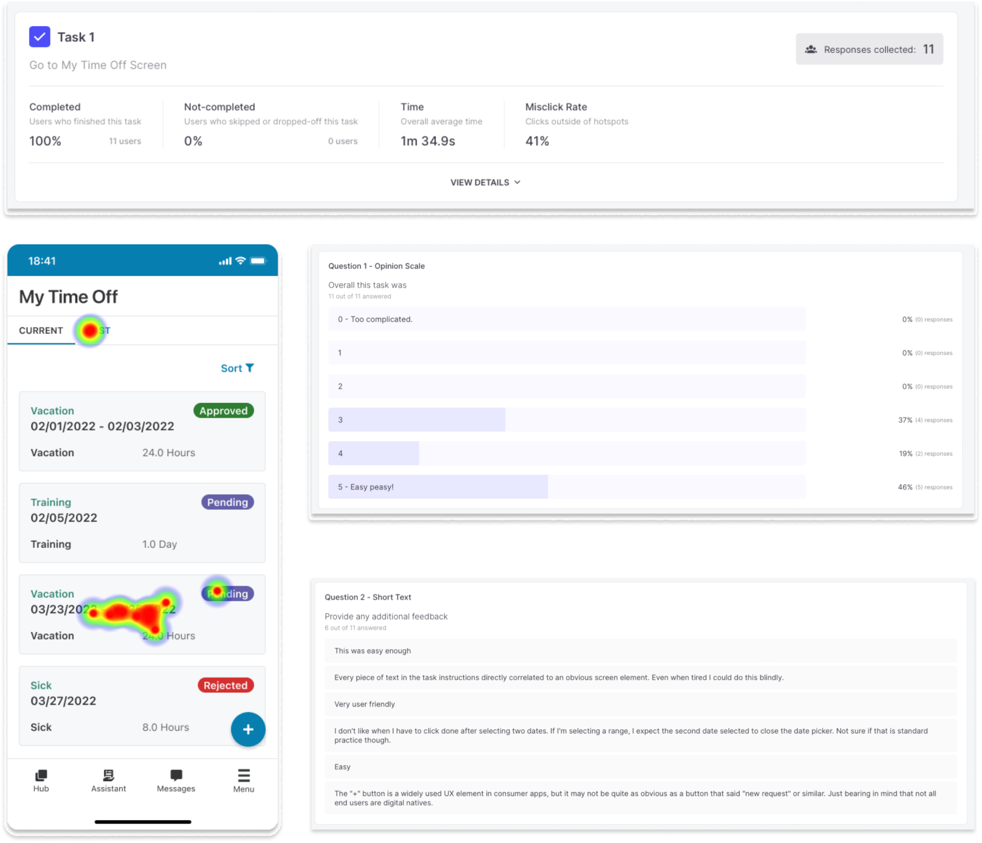
I worked closely with our research team to create a user interview study. The goal was to gather valuable insights about how our users perceived the existing platforms. These sessions confirmed our assumed pain points and enabled us to compile a list of recommended improvements for the redesign.
Design
Wireframes
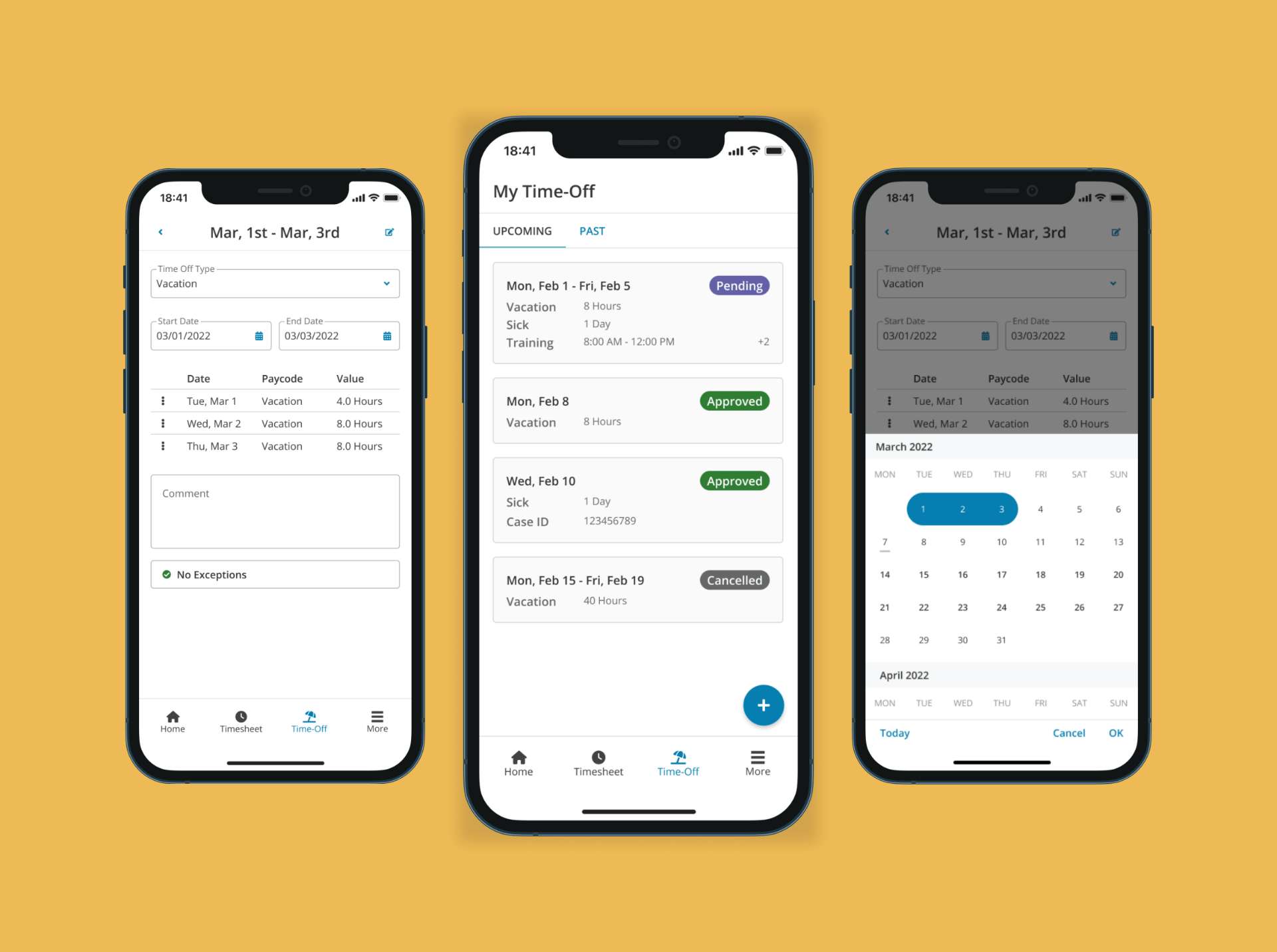
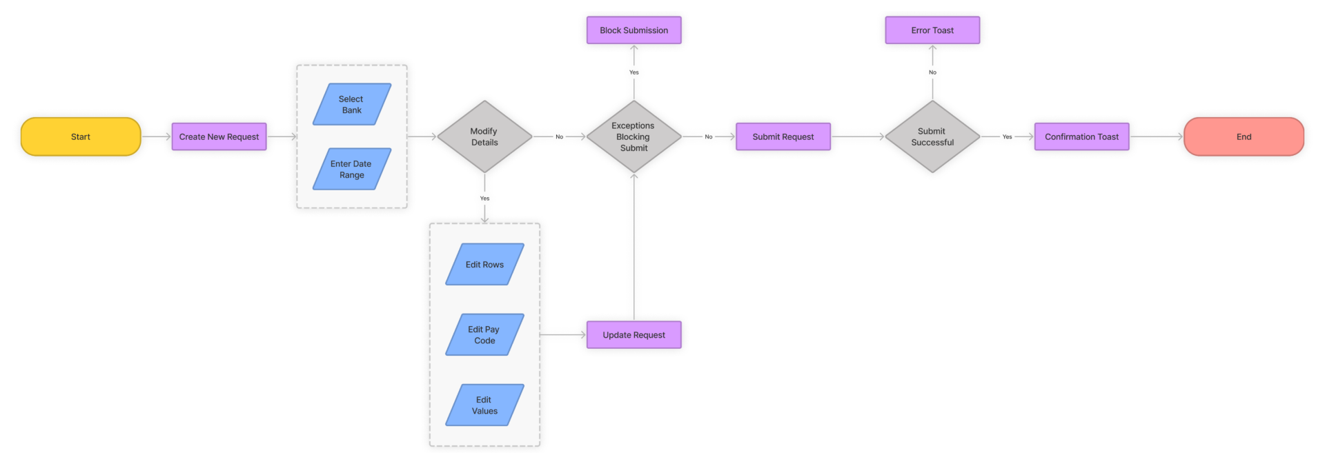
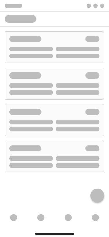
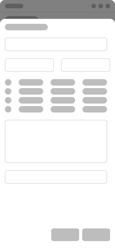
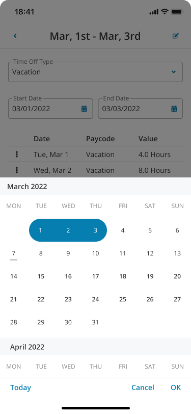
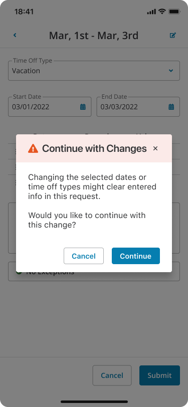
I focused on improving the user experience on mobile devices by implementing a mobile-first strategy. To evaluate the suitable components and design patterns for our proposed solution, I designed wireframes that emphasized the key interactions and layout considerations for mobile users.
High-Fidelity Mockups
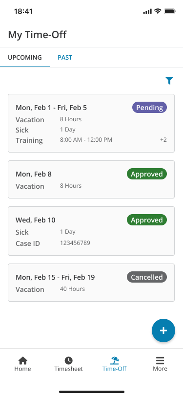
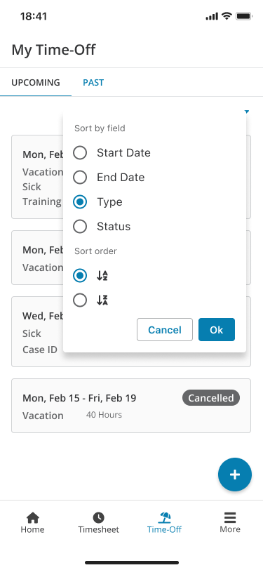
Next, I converted our wireframes into high-fidelity mockups to clearly show the interface and interactions. By incorporating visual elements such as colors, typography, and icons, we improved the design and ensured that stakeholders had a clearer understanding of the final product.
Interactive Prototypes
I utilized Figma to convert our detailed designs into interactive prototypes. These prototypes allowed us to simulate user interactions and will be utilized in the future to collect valuable feedback from end-users.